ON Motcomb is dedicated to providing personal shopping experience for luxury eveningwear which includes carefully curate pieces.
Designed by Studio Small


ON Motcomb is dedicated to providing personal shopping experience for luxury eveningwear which includes carefully curate pieces.
Designed by Studio Small

“Established in 2010, structure.space.skin is a company that provides a transparent service to its clients within the construction industry. The three main areas they focus on are structural management, spacial planning and interior design and this diverse offering needed to be conveyed simply and without superfluous detail. Studio Mad Keen worked with them on their positioning, which covered written tone of voice, logo, website, stationery and other items such as hoardings and branded products.”
Designed by Studio Mad Keen

“Edward Philips Creative, a London-based interior design consultancy, worked closely with Studio Mad Keen on their brand re-refresh which comprised positioning, identity, stationery, signage and literature. The project coincided with a stunning new purpose built studio and updated brand positioning. A hexagonal hallmark was included within the identity to convey quality and as a nod to one of nature’s most versatile, structural shapes.”
Designed by Studio Mad Keen

”Gotham Writers Workshop has helped a generation of New Yorkers express themselves. The school offers rigorous academics and invites people from all walks of life into its community. In recent years, however, the creative writing school found that its outward identity did not reflect its true vibrancy — this was having an impact on class enrollment. Hyperakt was asked to evolve the Gotham Writers Workshop brand and turn around its web presence in order to broaden its reach. The new voice of Gotham Writers Workshop needed to inspire younger writers to join the community, while leveraging the school’s proud reputation and preserving its NYC heritage.”
Designed by Hyperakt

”Handling digital data is our everyday business. Raiffeisen Rechenzentrum ensures that the bits and bytes don’t have an expiry date. And that the right people have access to the right files – everytime, everywhere. RRZ establishes an individual IT infrastructure for clients. So that they don’t have to deal with the technical side of information technology and can focus on their core business. After all it’s easier to work when you know that the ones and zeros are being well-kept.
”A new website, various printed materials and an image brochure provide insight in the Austrian IT company.”
Designed by Moodley

”Coco Chanel once said: “Fashion fades, only style remains the same.” She was right. Some pieces, all of them very special, never go out of style. Haute Vintage is constantly looking for valuable accessories from former collections to pass them on to people who really appreciate luxury goods.
”The website is a style-mecca for fashion lovers all over the web. Haute Vintage is composed of an online shop and a blog that serves as source of inspiration. And you can feel this passion and love in every click.”
Designed by Moodley

Very much inspired by Bright Corner’s business cards, instead of a fixed title like Graphic Designer, I opted for short description about the range of design projects I can do. It’s rather broad if you know what I mean. Careful not to put an overload of information, the words on the business card has gone through several revisions.
No logo? I personally feel that being a ’soon-to-be’ design graduate, there’s no need to associate myself with any form of personal logo or trademark. Reason being that I’d prefer to show potential employers that I’m excited to become part of their studio instead of me looking like a one-man-show.
What makes a good business card? For me, it has to best reflect me which I think the present card does a good job. Less on the visuals but more on the text. There’s ample space on the front for jotting down notes.Typeface used: Relato Serif by Emtype.net which you’ll be seeing used extensively in my portfolio.
Pay the bills? Bwuahaha. I can’t believe I put this in but I’m unashamed. Since I’m going to make design a way of earning a living, it’s just make sense that whatever I will be doing should pay for my bills especially just starting out in the design industry.

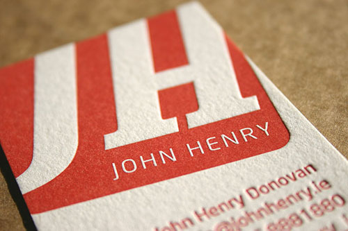
Every month Card Nerd holds a Business Card Of The Month award. This months award goes to: John Henry.


Every month Card Nerd holds a Business Card Of The Month award. This months award goes to: David Jarrell.

John Henry called on blush to print his business cards. After seeing John’s artwork we recommended the business cards were printed on Saunders 425gsm paper. A beautiful soft white cotton paper heavier than the average business card but not too thick to take up too much room in his wallet!
Getting the right amount of ink was critical for this design. We had to have enough coverage for the block at the top of the card without over inking the finer typography at the bottom.
Dimensions: 55 x 85mm
Letterpress printed on our vintage printing presses.
Designed by John Henry Donovan