Kategoriarkiv: card inspiration

50 tacos

“50 combinations of tacos will show the variety of our gastronomy and culture, seeking a branding that will represent the contemporary Mexican folklore in different ways, leaving behind the typical Mexican stereotypes of hats and cactus, and really show what we see in the streets of our country.”

Designed by Yeye Design

Almanegra

“Almanegra makes a oscure coffee cult using an alchemy of flavors, for his spells it uses grains collected from around the world. The secret will be revealed to the faithful followers.Photography by Gabriel Monroy (Querido Estudio).”

Designed by Yeye Design

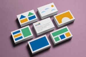
Transformadora Miscelánea

“Unique spaces, endless possibilities. Transformadora Miscélanea gathers numerous providers to create outstanding and inventive furniture, they can create almost every object with all kinds of materials. As a designer my goal was to create a very appealing brand that could be very bold but also could get along with almost every kind of canvas, as an analogy of what they do. I also decided to create a very versatile color palette that could disrupt simplicity and neutrality, but also could offer tons of possibilities, giving dynamism to every application. I solved every peripheral on this project in order to cut down costs of production and efficient its implementation by using already existing color papers.”
Designed by Luis Aboyte

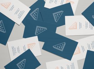
Tramezzino

“Being a sandwich shop in Milan, the name ”Tramezzineria” was coined to describe  a store of tramezzini which means sandwiches in Italian.

“Tramezzino is a soul food for North Italian but the client also wanted to attract new customers such as foreign tourists, since the location was close to the central station.

“Triangle shapes are used to make the meaning understandable, while the colour palette adds a kind of novelty to differentiate the shop from other traditional competitors.”

Designed by Tomomi Maezawa

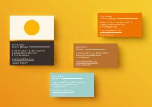
The World Bar

“The World Bar Queenstown hosts incredible adventure film movie premieres; banging parties with notorious DJ’s; live music both local and guest affiliated, and has served burgers to the masses and mixed famous teapot cocktails for Queenstown’s party animals. So whatever time you visit, they’re sure to have something special waiting for you. The World Bar Queenstown is a progressive bunch who like to keep it interesting and are not happy to settle for mediocre.”

Designed by makebardo

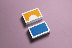
Bridge Baltimore

“Bridge Baltimore is a campaign by a creative startup called TOSO. It’s a campaign that promotes the work of an exterior home remodeling company that operates within the Baltimore area. With over 45,000 abandoned homes in the city (partly because they’re extremely expensive to renovate), the idea is to work with businesses and companies within the area to raise funds to revitalize the exterior of some of these homes.

“Based on the organization’s slogan, ”Let’s Create,” the logo is for the child in all of us that still love to “create” and a hope for the future. Consisting of two building blocks (1 of a bridge; the other of a rectangular block) creating a sunset over the Chesapeake.”

Designed by Tré Seals

SPV Architects

“A young and sophisticated architecture studio based in Mexico City. Full with cultural heritage, their approach to solving space riddles is simply sublime. Our approach was to create a timeless and clean look and feel. The logo represents the pillars of architecture according to renowned architect Gottfried Semper; it is also also an abstract monogram of their initials (see animation below).

“As part of this brand identity, we designed collateral deliverables in digital and diverse elements simulating local and handcrafted materials used in their projects.”

Designed by Diego Leyva

Gravity Nordic

“Gravity Nordic is a marketing production company operating from Helsinki and Stockholm. Gravity Nordic manages and delivers the best possible production solutions for their customers marketing materials, including handling the communications deliveries, schedules and ultimately the quality control. Our task was to create a new identity that would reflect this high quality service. To achieve an elegant yet contemporary look, we used a simple black & white colour palette in combination with gold foil. The logotype conveys quality and exclusivity, as does the subtle embossed pattern, used across various applications. These printed materials function as good examples of the custom and quality solutions Gravity can provide.”

Designed by Kuudes Helsinki & Stockholm

David Goh

“Studio Contact Studio Contact An image maker, DAVID GOH’s work spans the genres of fashion, portraiture and landscape. His images are characterised by the distinctive black and white and emotive style that applies the principle of pure photography; using simply natural light and shade. The branding for DAVID GOH had one very clear and distinct objective: to present the photographs and collaterals in a simple and effective way. Attuning to a clean and minimalistic design direction, we underscored the black and white photographs with a similar colour scheme – throwing them into sharp relief against a monochromatic palette.”

Designed by Nout Studio