Kategoriarkiv: card inspiration

Agnes Lloyd-Platt

“Agnes Lloyd-Platt is a fashion and beauty photographer based in London. Her work has been featured on the cover of Time and Rolling Stone magazine, and is characterised by positivity, colour, character and a graphic sensibility. She describes her work as progressively colourful, contemporary and free. Embracing playfulness she believes her subjects have majestic qualities, and that fashion photography should be uplifting and pleasing to look at.

“To convey the quirk and personality of her work we created a bespoke wordmark that is bold and confident, fashion but a little fucked-up, a touch psychedelic, with a bit of nostalgic magic given she frequently looks to the past for inspiration. The logotype lends itself to being used large, and as such can be used as a textural element to support her photography. The flexible system can be layered over imagery or used as graphic wallpaper behind images.

“To help Agnes feel personable we created versions of the logo which allowed us to break her first name away from her last name to feel more inclusive and approachable; on a first name basis so-to-speak.

“Online, to harness her overarching ethos of colour and positivity, we introduced an unconventional way to navigate her portfolio online; through the sorting of colour.”

Designed by Seachange Studio

Casa Natura

“Nature’s surreal details are a hidden code in the representation of organic forms drawn by artist Paula Cortazar, who collaborated in this magnificent project and experience with us. The result is a conceptual and unique identity, created in the tones of nature to shown tribute to the beautiful Tulum.”

Designed by Sabbath Studio

Nobl

“Nobl was established under the name Bodø Boligbyggelag (BBL) in 1946. As a housing cooperative, its mission was to build affordable apartments and small houses in Bodø, a necessity after the heavy bombing of the town during WW2. Over the years BBL has grown, today they have more than 16.000 members all over Nordland, and provide financial, technical and juridical expertise to their own housing cooperatives as well as stand-alone entities. They are also building and developing real estate in all of Nordland County.

“Due to the growth and geographical expansion over the years, BBL saw the need to iterate their brand strategy and change their name, after experiencing that the connection to Bodø in the name BBL, could be seen as distancing instead of including in other parts of the country.

“In the winter of 2016 we facilitated a series of workshops together with BBL. Starting with the brand strategy we re-worked and adapted this to todays situation, as well as developing a brand story to make sure that BBLs history was at the core of the new identity.

“We then proceeded to develop a new name. After several workshops, prototyping and research, we landed on the name Nobl. As well as being an abbreviation of Nordland Boligbyggelag, Nobl is pronounced as “Nobel” in Norwegian, which translates to “Noble” in English.”

Designed by by north™

Tartaruga

“My task was to create the visual identity for Tartaruga. Tartaruga is a weaving studio and it s born of passion shared by two friends. lovers of craft and beautiful design. They create contemporary kilims and wall hangings.

“They believe in slow design and use traditional tools and techniques. Materials, which they use were produced in sustainable way or were recycled. All the yarns are dyed with non-toxic dyes. Their fabrics are made with respect for environment and our employees.

“The focus of this identity was to create an elegant, ecologial brand that will not overshadow the beauty of the fabrics produced by the girls.

Tartaruga Studio is based in Kodz and it s not a coincidence. The city was strongly connected with textile industry from the very beginning. Tartaruga means ”a turtle”. The turtle is slow but long-lived and unique. Exactly like theirs fabrics.”

Designed by Marta Nawrocka

Trika

“Brand identity for Trika, an interior design studio working on both public and private spaces. Trika represent furniture and equipment manufacturers such as Billiani, Enea and Federicia, amongst many others.”

Designed by Bunch

Caribou

“The caribou have excellent vision, can see clearly in every direction and are exceptional navigators. Their keen eyesight enables the herd to move with one purpose towards their intended destination. An excellent metaphor for the clear vision I will bring to help an organisation identify and reach its strategic goals.

“Our approach was to create a concept design which allows us to have the flexibility to adapt to multiple possibilities.

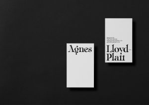
“We work over the premise that we need to achieve a professional brand with a solid background but at the same time needs to be fun, fresh, creative, energetic, etc. Our proposal was to unify all these concepts/values to create a strong, brave and unique visual identity. Our strategy for creating a clear difference between Caribou and its competitors was to work with a contemporary visual proposal. We developed a confident brand through decisions in morphologies, typographies, tagline, colours and with a flexible visual identity.

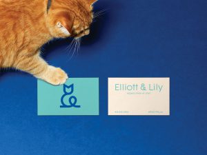
“We used the metaphor of ‘horns hands’ because the main service of ‘Caribou’ is to help clients to achieve their goals through a clever strategy. The hands instead of horns means that ‘Caribou’ contains and support their clients throughout the process. A clear and clever message.

“We decide to work with the whole animal for two reasons: the first one is because the brand doesn’t omit anything, it’s honest & committed. The second reason is that if we work only with the head of the Caribou, we will be communicating that the animal is dead. We want to reflect in every detail that we are alive and with lots of energy.

“01 Body / We decide to work with the whole animal for two reasons: the first one is because the brand doesn’t omit anything, it’s honest & committed. The second reason is that if we work only with the head of the Caribou, we will be communicating that the animal is dead. We want to reflect in every detail that we are alive and with lots of energy.
02 Standing / The Caribou standing give us the feeling that the brand is supported by an experienced background.
03 Looking at the front / This is not random. The ‘Caribou’ has a perspective in the future and growth of the clients. This means that we have a positive attitude with a clear vision.
04 The ‘horns hands’ / We used the metaphor of ‘horns hands’ because the main service of ‘Caribou’ is to help clients to achieve their strategic goals. The hands insted of horns means that ‘Caribou’ contains and support their clients.
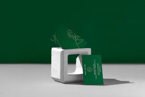
05 The balance / Inside of the isologo we can visualize a pyramid. This means that ‘Caribou’ helps their clients to achieve a balance in every field of their business.

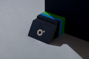
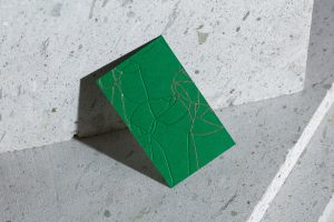
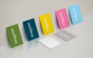
“We decide to work with a broad colour palette. This brings to the brand a fresh, creative and dynamic soul.
From the colour psychology, gray is the color of commitment. Green is the colour of balance and growth. Blue is the colour of trust and peace. Pinkis unconditional love and nurturing. Gold is the colourof success, achievement and triumph.”

Designed by makebardo

SendEAT

“SendEAT is an online food delivery company operating in the Portuguese market. They approached VOLTA in search of a new name, visual identity and website design that would better define its business and its service. The company prides itself on a great restaurant network, impeccable service and the possibility of tracking your delivery route in real time.

“VOLTA’s approach focused on what we thought was the real advantage point of the company, compared to other food delivery services: seeing your order travelling through an online map, in real time, and having that comforting feeling of knowing your meal is about to arrive.

“After throwing on the table several options, we decided to go with SendEAT, as it expresses a direct relation between eating and an order delivery service. When it comes to its visual identity, instead of focusing on the clichéd fork, plate or spoon shaped logo, we took inspiration on the city maps the orders travel through. We decided to stencil the word’s lowercase characters, as if they were cut by the streets the orders travel through to reach their destiny. Bold and punchy colours were used, in order to give feelings of variety and dynamism and to cater to different tastes and options, just like the company’s service does.

“We also decided to create a tagline to best express SendEAT’s brand promise, using a common phrase, and adapting it to the company’s main service reality: Eat’s on your way.

“The result is a simple yet vibrant brand identity, with a contemporary look & feel and a clear message: we want to get the best food to the best customers – our customers.”

Designed by VOLTA | Brand Shaping Studio

Elliott & Lily

“Establishing the identity of a business that specializes in pet adoption and sells products for cats and dogs. Proud partner of SPA de Québec, this next-gen pet store offers a vision of adoption that is both tender and playful. Continuous fluid lines of white, blue and sea green come together to fluidly depict a stylized cat here and a dog there. With the dots, these threads also serve as artful mapping of a pet’s trajectory in a visual context designed to convey feelings of bonding and empathy and to shine a light on all the joys these little furries bring into our everyday lives.”

Designed by Agency lg2