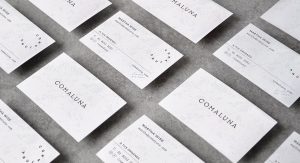
“Comaluna is a pastry shop inspired in an out of this world experience – a world of cheese! Passed down by three generations, their recipes are full of detail and tradition, and the combination of their textures and flavors make their desserts extraordinary. Every cheesecake takes around 5 hours to bake, and the result is a perfectly textured cake with no break outs.
“The concept behind the brand is built around the moon, taking as reference children’s books and the idea that the moon is made of cheese. The name is a translation of a play with the words Eat and Moon. The pattern depicts an image of the world from outer space. The variations in the logotype configuration were inspired in the different phases of the moon, and its movement revolving our planet. Visual and typographic styles were inspired in a traditional recipe sheet, which contains traditional elements, but also handwritten notes and a hint of modernism.
“Comaluna raises the bar on traditional pastry shops. Their cheescakes and toffee give the customer an invitation to experience an out of this world dessert. They speak of tradition, expertise, and the perfection of a well-crafted recipe that is ready to please even the most demanding palates. You’ll love them to the moon and back!”
Designed by Firmalt ⋅


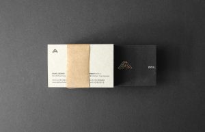
 “The “Kostikoglou” Family who operates in the fabric market and has a history that dates back since 1923, trusted us to create their new corporate identity. For the brand we created an elegant and sophisticated expression through a series of visual solutions that manage to carry out its classical and historical values.

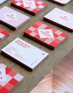
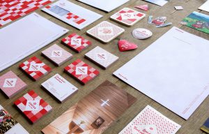
 “At the summit of feelings. On top of quality standards. The three hotels “Mooshaus“, “Alpenrose“ and “Elisabeth“ belonging to the Gerber family, offer incredible holiday pleasure. The guests of the three hotels should be able to identify with the sporty, sophisticated and feel-good oriented new umbrella-brand, GERBER HOTELS: The remarkable elegance, the initials formed through the mountain-skyline as well as the inspiring contrast of black an the two spot colours gold and copper will remain unique and exceptional.”
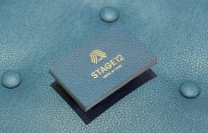
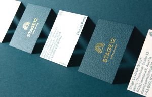 “A modern city hotel has opened in the centre of Innsbruck, on the site of a former theatre. The new CD aims to transport both visually and verbally the hotel’s special location on one of Innsbruck’s main shopping streets as well as its international flair. We want to make the hotel an urban stage. The name and logo will form the basis for an outstanding performance that enables the hotel’s fresh charm and elegant character to be in the spotlight. This core idea is reflected in all printed media and advertising material. Instead of the typical Tyrol clichés and local tourism messages, we want to use an international design language. Stylish illustrations and eye-catching colour combinations will replace photos already seen a thousand times. We will create a feel of genuine authenticity, far away from shiny brochures and menu covers made of artificial leather. The written messages speak an internationally understandable language – delivered with subtle nod and a wink.”