

In today’s fast-paced digital world, standing out in the sea of professionals is more important than ever. Have you ever considered how to elevate your business card game to a new level? Well, get ready, because today we’re going to delve into one brilliant innovation that’s been making waves in the professional world: QR codes on business cards. Here’s why it’s a brilliant idea!
1. Instant Connectivity: Remember the days of typing out long URLs or email addresses? With a QR code, this problem evaporates. Just a quick scan with a smartphone camera, and boom! Your professional profile, business website, or digital portfolio opens up instantly.
2. Effortless Information Exchange: Imagine being able to provide all your contact details, and more, in a simple, scan-able square. A QR code on your business card can hold data like your email, phone number, LinkedIn profile, or even a VCard for a seamless addition to the scanner’s contact list.
3. Space Savers and Design Enhancers: Given their compact size, QR codes save significant space on your card. This leaves more room for innovative design elements, allowing you to maintain aesthetic appeal while delivering a comprehensive professional snapshot.
4. Environmentally Friendly: Let’s not forget our planet! Digitizing information means less paper used for extra brochures or pamphlets. You can share the same information (and more!) via the QR code. Eco-conscious clients will definitely appreciate this effort!
5. Tech-Savvy Impression: In a world where staying updated with technology is vital, a QR code on your business card sends a clear message: You’re adaptable, innovative, and digitally inclined. It showcases your readiness to embrace new tech trends and innovations.
6. Trackable Interactions: From a marketing perspective, QR codes can be your secret weapon. You can track scans and collect valuable data about the people who are interested in your services. This will help you target your follow-ups more effectively.
The magic of QR codes lies in their simplicity and versatility. With just one scan, you’re offering a wealth of information, leaving a lasting impression and establishing a powerful professional connection. In the realm of networking, this small square could be the game-changer that sets you apart from the crowd.
So, when you’re ordering your next batch of business cards, why not consider including a QR code? It’s an exciting step towards the future, making connections simpler, quicker, and more efficient.
Remember, in today’s digital era, the smallest changes can make the biggest impact. So, go ahead, power up your networking game with QR codes on your business cards!


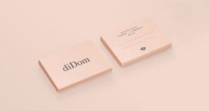 “diDom is a store located in the heart of Madrid’s Golden Mile with more than 30 years of history, specializing in the sale of shoes and accessories for weddings and celebrations. We were asked to redesign the entire brand to completely change its old-fashioned image and position themselves in today’s wedding markets.


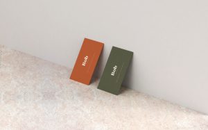 “Visual identity, art direction, and graphic design for Melbourne based hair studio, Bob. Bob is a natural hair salon founded on the belief that a simpler approach to well-being enriches our lives. A minimalist design compliments a philosophy based on natural ingredients and sustainable practices.”

 “DWELL the space We make big and small things — out of concrete.”
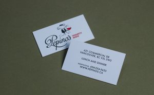 “Long-time Vancouverites may recognize the location of Pepino’s as the former home of Nick’s Spaghetti House, a neighbourhood classic Italian Spaghetti House that shuttered in late 2017 after 60 years of business. The new owners wanted to pay homage to its heritage, but the former owner, Nick Felicella, wished to retire his name. Inspiration struck the owners in the form of a 1962 song by Italian-American singer Lou Monte called “Pepino, the Italian Mouse”. The discovery was a serendipitous one, with the playful ditty connecting to both Nick’s Spaghetti House: Felicella had owned a racehorse named Spaghetti Mouse, and the rascally rodent character in the song provided a perfect namesake.
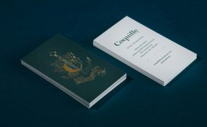 “Coquille Fine Seafood, is a sophisticated fish house in Vancouver’s Gastown neighbourhood; as you walk in it immediately sets a theatrical, oceanic tone. All aspects of the room and bran embraced aquatic motifs wholeheartedly. A modern spin on a classic fish house concept, the 4,100-square-foot restaurant offers a creative menu of quintessential seafood and shellfish dishes accompanied by a wide-ranging drink menu featuring craft beer, handmade cocktails and notable BC and international wines. With seating for 100 in an expansive dining room, bar and lounge appointed with nautically-inspired décor, Coquille Fine Seafood allows locals and visitors alike to enjoy a relaxed-yet-elegant dining experience for lunch, dinner, happy hour and late night drinks.